Border Designs using Html & CSS:Gradient & Image
Today we are going to do border designs. Because we can build up fancy border designs with gradient border. Not only that we can create an image border too. Firstly, we see how to create a gradient border in CSS. For that, open your editor. Then you have to build your code as below codes.
Border Designs using Gradient Borders
<!DOCTYPE html>
<html>
<head>
	<title>Gradient borders</title>

</head>
<body>
     <div class="box"></div>
</body>
</html>
Now you can see blank web page . Because we did not use inputs . Then see how we can design our gradient border .
<!DOCTYPE html>
<html>
<head>
	<title>Gradient borders</title>
	<style type="text/css">
body
{
	padding: 0;
	margin:0;
	background:black;
}
.box
{
	width: 400px;
	height: 400px;
	position: absolute;
	top: 50%;
  	left: 50%;
	transform:translate(-50%,-50%);
	border: 10px solid transparent;
	border-image: linear-gradient(45deg, #ff0, #f0f, #f00, #00f, #0f0);
	border-image-slice: 1;
	box-shadow: 0 15px 25px rgba(0,0,0,.2);

}
</style>
</head>
<body>
     <div class="box"></div>
</body>
</html>
The border property is a shorthand property for
- Border-width
- Border-style
- Border-color
Here I used border image property. I add Linear-gradient value to it.
border-image: linear-gradient(45deg, #ff0, #f0f, #f00, #00f, #0f0);- first value applies angle between horizontal line and gradient line.
- second , third …..values are apply for color-stop1,color-stop2 …. respectively.
And border-image-slice property specifies how to slice image. Here 1 represents pixel for raster image or coordinates for vector images.
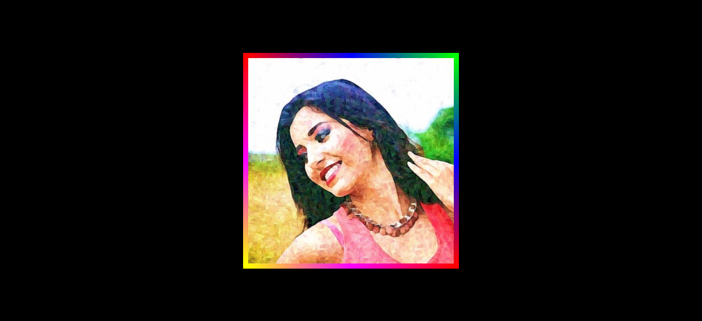
If you entered the code above correctly then your web page should now look this :

Now you can use this as your wish. You can add a gradient border with border-radius. I like to add a photo inside this border. So now we see how we can do it.
        background: url(bg.jpg);
	background-position: center;
  	background-size: cover;
You have to add those above properties into the boxing class. If you entered the code correctly then your web page should now look this :

Moreover, you can use the border-image property to add an image border to your web page. It is the same as the above steps. only you have to follow the below codes.
<!DOCTYPE html>
<html>
<head>
	<title>Image borders</title>

	<style type="text/css">
body
{
	padding: 0;
	margin:0;
	background:black;
}
.box
{
	width: 400px;
	height: 400px;
	top: 20%;
	left: 35%;
	position: absolute;
	border: 10px solid transparent;
        border-image-source: url(heart.png);
        border-image-slice: 20 22;
        border-image-repeat: round;
        border-image-width: 30px;


}
</style>
</head>
<body>
     <div class="box"></div>
</body>
</html>
Here I used my border image as below one. You also can find like this.

The border-image-repeat property exhibits, the border-image should be repeated, rounded, or stretched. If I used round as property’s value, the Image will be repeated to fill the area. If not the fill area, the image is rescaled to fill the area. to stretch as the property’s value, the extra space is distributed around the tiles to fill the area.
the border-image-width property defines the width of the border. You can see Image border example below.

Thank a lot and keep with us to know more and we will be soon with the next part. And also please share this with your friends and if you have a problem, you can comment here.

Pingback: Let’s create colorful Login page using HTML & CSS – MAZ TECH