Search Bar using HTML & CSS
Today we are going to create, a simple and elegant search bar using HTML & CSS. Here I use Sublime Text as my editor. First of all, you have to open your editor, and then try to do below things. I saved my Html file as an index.html.
Html file to create a search bar
However, I used inputs to create this. now see how we can use them.
<!DOCTYPE html>
<html>
<head>
	<meta charset="utf-8">
	<title>group input form</title>

</head>
<body>
	<div class="box">
		<h1>Search</h1>
		<form>
			<input type="text" name="" placeholder="Type...">
			<input type="submit" name="" value="Search">
		</form>
	</div>

</body>
</html>
Here, The placeholder attribute specifies a short hint that describes the expected value of an input field. The short hint shows in the input field before the user enters a value.
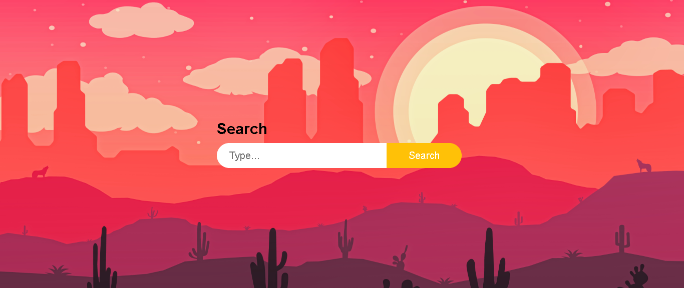
If you entered the code above correctly then your login form should now look this.

CSS file
Then I created ‘ style.css ‘ file and connect it to ‘ index.html ‘ using link tag.
<link rel="stylesheet" type="text/css" href="style.css">After that you have to code in style.css for designing our colorful search bar.
body
{
	margin: 0;
	padding: 0;
	background: url(s.jpg);
	font-family: sans-serif;
	background-repeat: no-repeat;
	background-size: cover;
}
You can use any background image in here, it is your choice. when you using a background image for your page, You have to save it in the same folder where you saved your HTML and CSS files. If you correctly added above code you can see below page.

Then I add properties to design h1 tag using below code .
h1
{
	margin: 0 0 10px;
	padding: 0;
	color: #000;
	font-size: 30px;
}
As you can see, here I used margin property with 3 values . If the margin property has three values, it defines:
- first value for top margin
- second value for right and left margins
- third value for bottom margin

After that , I designed input in the page. see how I use properties to create this .
.box
{
	position: absolute;
	top: 50%;
	left: 50%;
	width: 500px;
	transform: translate(-50%,-50%);
}
input
{
	position: relative;
	display: inline-block;
	font-size: 20px;
	box-sizing: border-box;
	transition: .5s;
}
input[type="text"]
{
	background: #fff;
	width: 340px;
	height: 50px;
	border: none;
	outline: none;
	padding:0 25px;
	border-radius: 25px 0 0 25px;
}
input[type="submit"]
{
	background: #ffc107;
	left: -5px;
	width: 150px;
	height: 50px;
	border: none;
	outline: none;
	padding:0 25px;
	border-radius: 0 25px 25px 0;
	cursor: pointer;
	color: #fff;

}
Note:
The position property specifies the type of positioning method used for an element.
- absolute means element is positioned relative to its first positioned parent element.
- relative means element is positioned relative to its normal position.
Here I used transform property to apply 2D or 3D transformation to an element. This property allows you to rotate, scale, move, skew, etc …., elements. And I used to translate(x, y) value. It defines a 2D translation.
border-radius property
After that, I used border-radius property to add rounded corners to elements.
border-radius: 0 25px 25px 0;- the first value applies to the top-left corner
- the second value applies to the top-right corner
- the third value applies to the bottom-right corner
- the fourth value applies to the bottom-left corner
transition property
I applied transition property to the input . transition is a shorthand property for
- transition-property
- transition-duration
- transition-timing-function
- transition-delay
In here, 0.5s used to specify how many seconds the transition effect takes to complete.
If you added these code in your CSS file correctly , then you can see below page .

When you move your cursor to the search button ,Its’ color changing .see how we can do it using hover effect.
input[type="submit"]:hover
{
	background: #ff5722;
}
After that, If you write this code correctly. You can get below output after move your cursor to the search button.

Finally, You can see your beautiful web page. Now, I think you will try these things. Do more and more to improve your skills. And also please share this with your friends and if you have a problem, you can comment here. Thank a lot and see you at the next lesson.


tnx for your post, i am learned a lot from this. my suggestion is
use gif for better understanding
Thank you for your feedback 🙂