How to add Glowing Text Effect Using HTML & CSS
Today we try to know how can we add animations to our web page without add JavaScript or flash. Here we mainly focus on the glowing text effect. It is like a neon text. Because we can use CSS to get a glowing text effect.
Firstly, you have to create your HTML file and save it as an “index.html ” or use any name as you wish. After that, you can build your code like below.
<!DOCTYPE html>
<html>
<head>
<title>Glowing Text Effect</title>
</head>
<body>
<h1>
<span>H</span>
<span>E</span>
<span>L</span>
<span>L</span>
<span>O</span>
</h1>
</body>
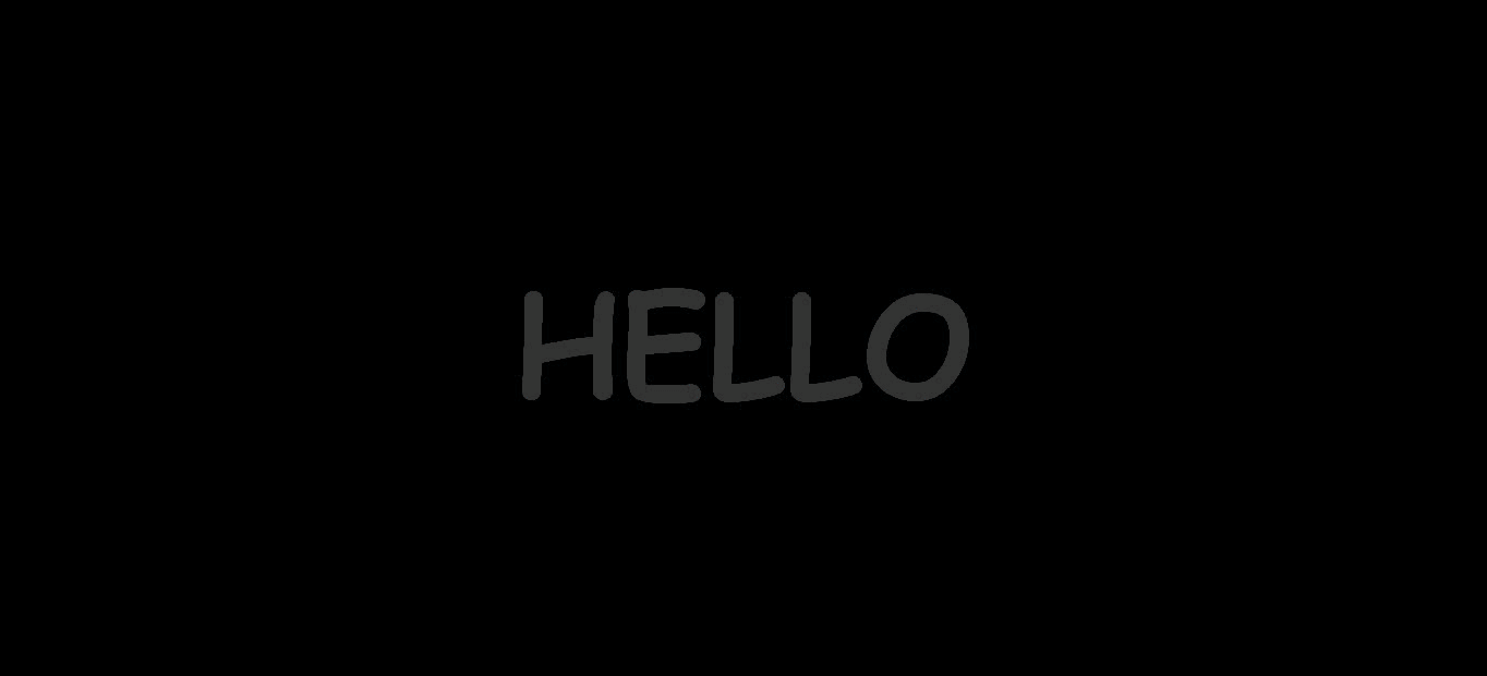
</html>Here I used span tag, It is an inline container used to markup a part of a text, or a part of the document. You can add any number of span tags, which length of your element. Now you can see below page.

To design your web page, you have to create style.css file or you can add them within style tag. You can use the link tag element to connect your HTML file and CSS file.
<link rel="stylesheet" type="text/css" href="style.css">Moreover, in CSS file we can add properties and values to design our glowing effect.
@import url('https://fonts.googlleapis.com/css?family=Bad+Script');

body
{
	margin: 0;
	padding: 0;
	justify-content: center;
	align-items: center;
	height: 100vh;
	background: #000;
	display: flex;
	font-family: 'Bad Script', cursive;
}
h1
{
	margin: 0;
	padding: 0;
	color: #333;
	font-size: 8em;
}
Here I import font-style using google fonts. You can search and add your favorite font .
Justify-content property aligns the flexible container’s items when the items do not use all available space on the main-axis. align-items property uses to align items in vertically.
The display property defines how an element can be displayed. We can use flex to display an element as a block-level flex container.
So, you can see I used height:100vh. Here vh relative to 1% of the height of the browser window size. In h1 tag font-size property, its’ value is in em. It relates to the font-size of the element (8em means 8 times the size of the current font).
If you add your code correctly you can see like below.

After that let’s we design span tag.
h1 span
{
	display: table-cell;
}
When we use display property with table-cell value , that element behave like a <td> element.

CSS allows animation of HTML elements
What is CSS animation ?
animation means an element gently change from one style to another.we can change many CSS properties if we want, as many times . Before use CSS animation, first we have to specify some key frames for the animation.
Now we see how add animation to this.
h1 span
{
	display: table-cell;
	animation: animate 1s linear infinite;
}
Here animate is the animation-name.
animation property is a shorthand property for
- animation-name
- animation-duration
- animation-timing-function
- animation-delay
- animation-iteration-count
- animation-direction
- animation-fill-mode
- animation-play-state
In my code,
animation: animate 1s linear infinite;- First value for animation name.
- second value for duration of the animation.
- third value for animation time function.
- fourth value for animation delay.
Then you have to code below codes in your css file.
h1 span:nth-child(9n+1)
{
		animation-delay: 0.5s;
}
h1 span:nth-child(9n+2)
{
		animation-delay: 1.25s;
}
h1 span:nth-child(9n+3)
{
		animation-delay: 2.35s;
}
h1 span:nth-child(9n+4)
{
		animation-delay: 2.75s;
}
h1 span:nth-child(9n+5)
{
		animation-delay: 1s;
}

@keyframes animate
{
	0%,100%
	{
		color: #fff;
		filter: blur(2px);
		text-shadow: 0 0 10px #00b3ff,
					 0 0 20px #00b3ff,
					 0 0 40px #00b3ff,
					 0 0 80px #00b3ff,
					 0 0 120px #00b3ff,
					 0 0 200px #00b3ff;

	}
}
Here:nth-child(n) selector matches every element that is the nth child, regardless of type, of its parent. n can be any number, keyword, or formula.
I used formula like (an+b) ,here ‘a’ represent cycle size. ‘n’ is a counter starts from 0, and ‘b’ is and offset value.
animation-delay property defines the time between the element being loaded and the start of the animation sequence .
I used @keyframes, it specifies when the style change will happen in percent, or with the keywords “from” and “to”, which is the same as 0% and 100%. Here 0% is the beginning of the animation and 100% is when the animation ended.
Moreover, During the animation, you can change the set of CSS styles as you wish. Not only that, You can have many keyframes-selectors in one animation.
Here I used text-shadow property.
text-shadow: 0 0 10px #00b3ff,- the first value applies to define the position for horizontal value
- the second value applies to define the position for vertical value
- the third value applies for blur radius value
- the fourth value applies for the color of the shadow
And to add more than one shadow to this, add a comma-separated list of shadow.

If you entered above codes correctly you can see Glowing text in your web page. I hope you definitely try to do this .Keep with us to know more .