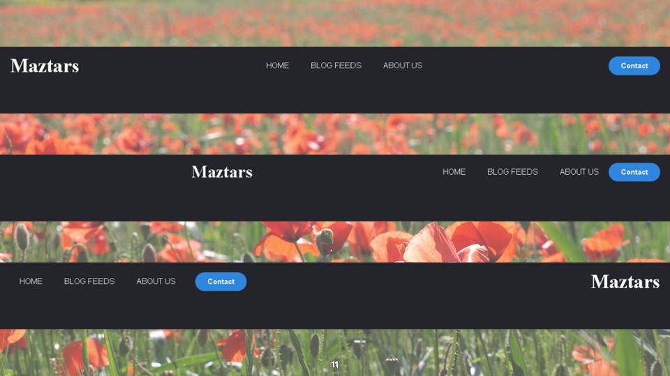
Navigation bar Design : 3 ways to create a Navigation bar.
The first way to create a Navigation bar
Today I am going to design three navigation bars. It is very simple to understand. Most people face many troubles when creating a navigation bar. Because this is a better way to improve your Html and CSS skills. First of all, you have to create your HTML and CSS files.
Create an Html file
Then in your HTML file, you have to write the below codes.
<!DOCTYPE html>
<html>
<head>
	<title>Navbar</title>
</head>
<body>
	<header>
		<label class="logo">Maztars</label>
		<nav class="links">
			<li><a href="#">Home</a></li>
			<li><a href="#">Blog Feeds</a></li>
			<li><a href="#">About Us</a></li>
		</nav>
		<a class="btn" href="#"><button>Contact</button></a>
	</header>

</body>
</html>
Now you can see the below page.

Create a CSS file
Moreover, Here I create a CSS file as Style.css, then link this file with an HTML file using the link tag.
<link rel="stylesheet" type="text/css" href="style.css">After that, you have to write properties and values to design your navigation bar. Let’s do it.
*
{
	margin: 0;
	padding: 0;
	box-sizing: border-box;
	background-color: #24252A;
	color: #fff;
}
Here I used ” * ” . Do you know why? We can use it when you want to set a style for all the elements of an HTML page or for all the elements within an element of an HTML page.

After that we create a navbar.
li, a, button
{
	font-family: sans-serif;
	text-decoration: none;
}
header
{
	display: flex;
	justify-content: space-between;
	align-items: center;
	padding: 15px 20px;
}
Here you can see I used some elements with comma. You also can use some elements together, when you need some changes in some elements. text-decoration property determines the decoration added to the text. However, The text-decoration property is mostly used to remove underlines from links.
Furthermore, here I used display property and its value as flex. The flex is much responsive and it is easy to positioning child elements and the main container.
The justify-content property aligns the flexible container’s items when the items do not use all available space horizontally. Its’ value space-between specifies items are positioned with space between the lines.
when using the align-items property, It helps to align the items vertically. If you add the above codes correctly you can see the below page.

Then we design class = ‘logo’ selector.
.logo
{
	font-weight: 600;
	font-size: 40px;
	cursor: pointer;
}
It will change your navigation bar like below.

The next step is designing our list, adding properties and values.
.links
{
	list-style: none;
}
.links li
{
	display: inline-block;
	padding: 0 20px;
}
.links li a
{
	text-transform: uppercase;
}
Here display: inline-block used to display list items horizontally instead of vertically.
text-transform property controls text case and capitalization.
- lowercase uses to make all of the letters in the selected text lowercase.
- uppercase makes all of the letters in the selected text uppercase.
- capitalize uses to capitalize the first letter of each word in the selected text.
Now you can see your web page like the below example page.

Design a button
Then we will see how can we design a button in the navigation bar.
button
{
	padding: 10px 25px;
	background-color: #2e86de;
	border:none;
	border-radius: 50px;
	cursor: pointer;
	color: #fff;
	font-weight: 600;
	font-size: 15px;

}
After that, if you add the above code to the button element you can see the below changes.

Then we see how to add a hover effect to this.
.links li a:hover
{
	border: 2px solid #1B9CFC;
	padding: 5px;
	font-size: 20px;

}
The: hover selector is used to selecting elements when you mouse over them. Select and style elements that you need to add hover effect when you mouse over it.

If you correctly add those codes it will see like above.
Second way
Now this way is simple. You can create another navigation bar with only add few changes to the previous one. Then we see how to do it. You have to change the CSS file only.
If you adjust the justify-content value, space-between to flex-end it will change your navigation bar to the new one.
justify-content: flex-end;

Then you can set the margin property to the class=”logo” to auto to horizontally center the element within its container.
margin: auto;It will take up the specified width, and the remaining space will be split equally between the left and right.

Third way
For this type, you can use previous HTML and CSS files with few changes. Then we see what are the changes can we do. Moreover, The below output gives the third type to create the navbar.

To get this view you have to add order property to the class=”logo”.
order: 3;The order property sets the order to lay out an item in a flex or grid container. In a container, items are sorted by ascending order value and their source code order.
Now I think you got a clear idea about how to create a navigation bar for your web page. Just take a try to do this. It will improve your skills definitely. Please stay tuned with Maztars to know more. Thanks a lot and see you at the next lesson.
